Improving Website Design with Elementor
After learning the basics, I thought I was doing well until I looked at my website. It worked, but it didn’t look professional. That’s when I realized that building a website and designing a good website are two different things.
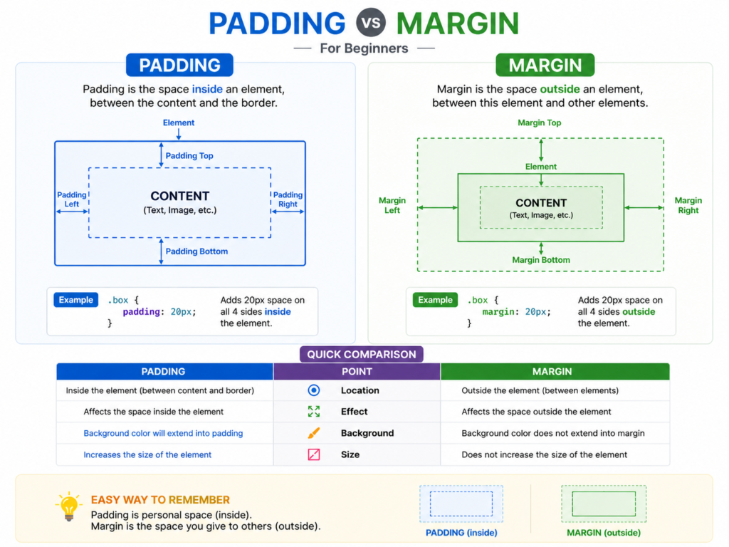
At the intermediate stage, the focus shifts to improving design, structure, and user experience. One of the biggest lessons I learned is the importance of layout. Every page is built using sections, columns, and widgets, but how you arrange them makes all the difference. Marging and Padding Spacing is something I ignored at first. My content looked crowded because everything was too close together. Elementor has options like padding and margin that help create space between elements. Once I started using spacing properly, my design looked much cleaner.
Another thing that helped me a lot was using templates. Elementor provides pre-designed templates that you can import and customize. Instead of starting from scratch, you can learn by editing these templates and understanding how they are structured.Mobile responsiveness is extremely important. Most users visit websites on mobile devices, but I didn’t realize this in the beginning. Elementor allows you to switch between desktop, tablet, and mobile views. You should always check your design on mobile and adjust font sizes, spacing, and layout accordingly.
Consistency is another key factor. Earlier, I used different fonts and colors in different sections, which made my website look unprofessional. Then I started using global settings—choosing one or two fonts and a fixed color palette. This made a huge difference.
At this stage, I also started learning basic SEO. Installing plugins like Rank Math or Yoast helps optimize your website. Adding proper titles, descriptions, and keywords improves visibility, even if you’re just starting.
A good homepage should have a clear structure. It usually starts with a hero section, followed by an about section, services, testimonials, and a contact section. This helps users navigate your website easily.One mistake I kept making was adding too many animations and effects. While they looked attractive, they slowed down my website and distracted users. I realized that simple and clean design works better.At this level, your thinking changes. You start focusing on how users experience your website, not just how it looks.